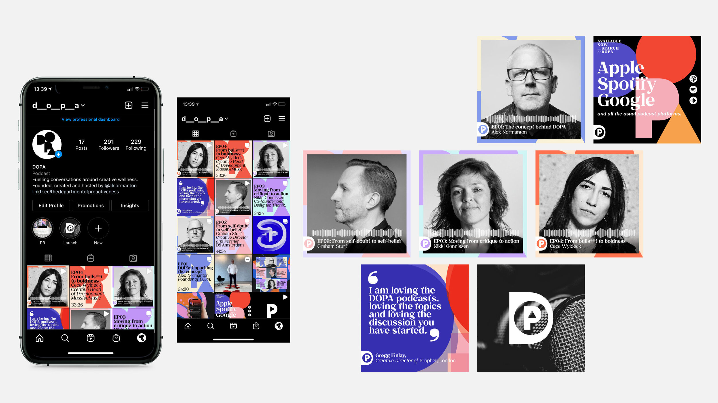
DOPA
The Department
of Pro-Activeness
Brand identity, motion, OOH, sonic branding, digital and social
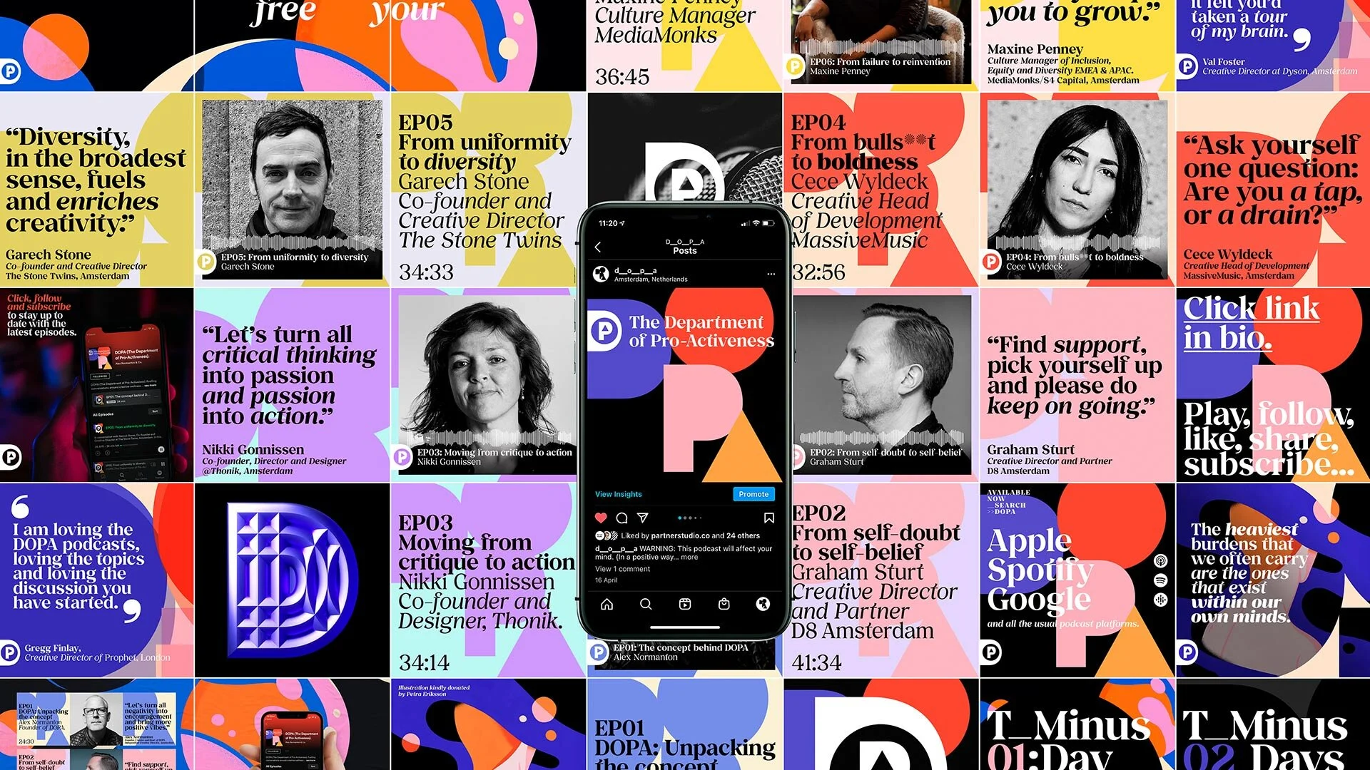
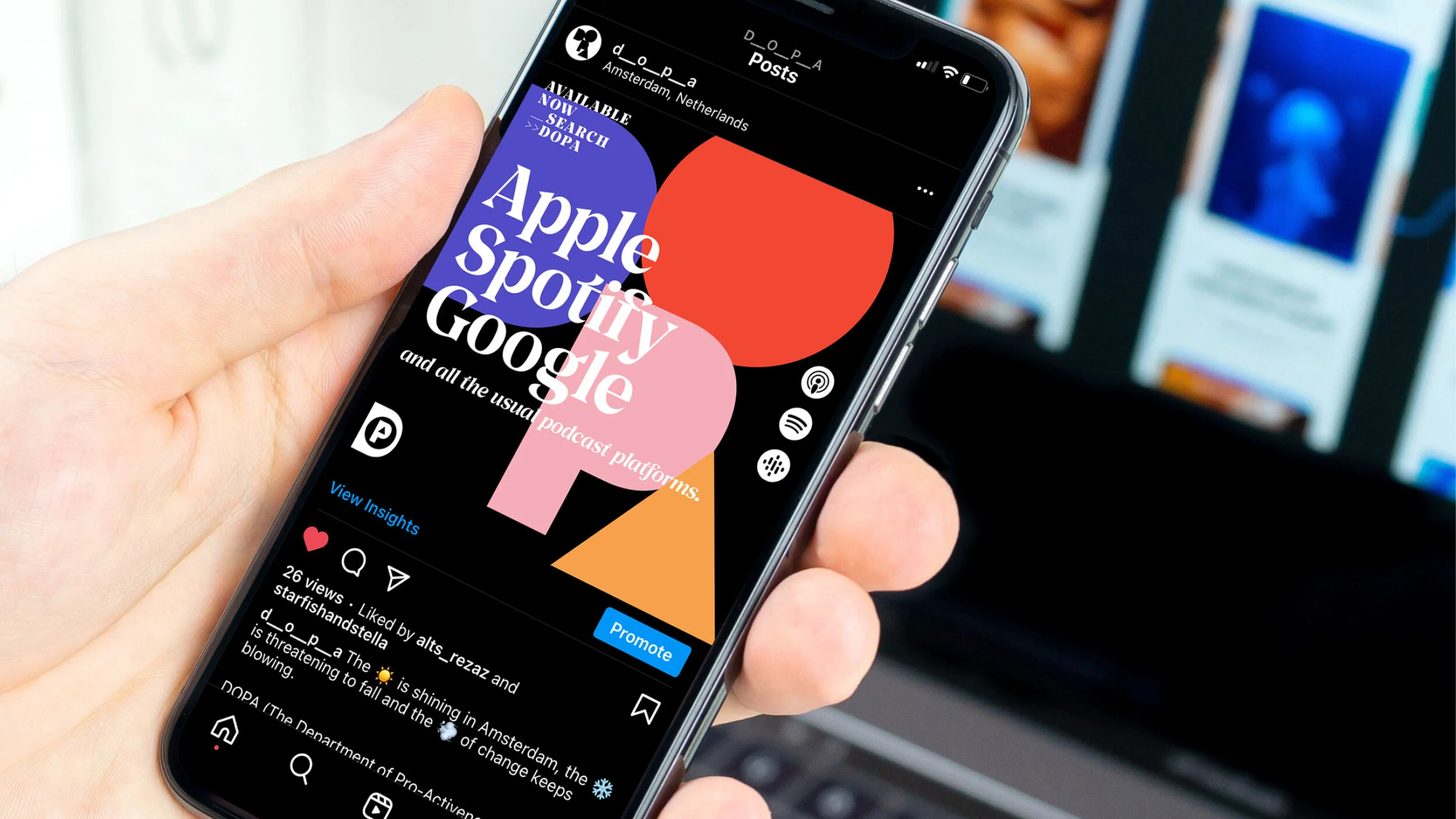
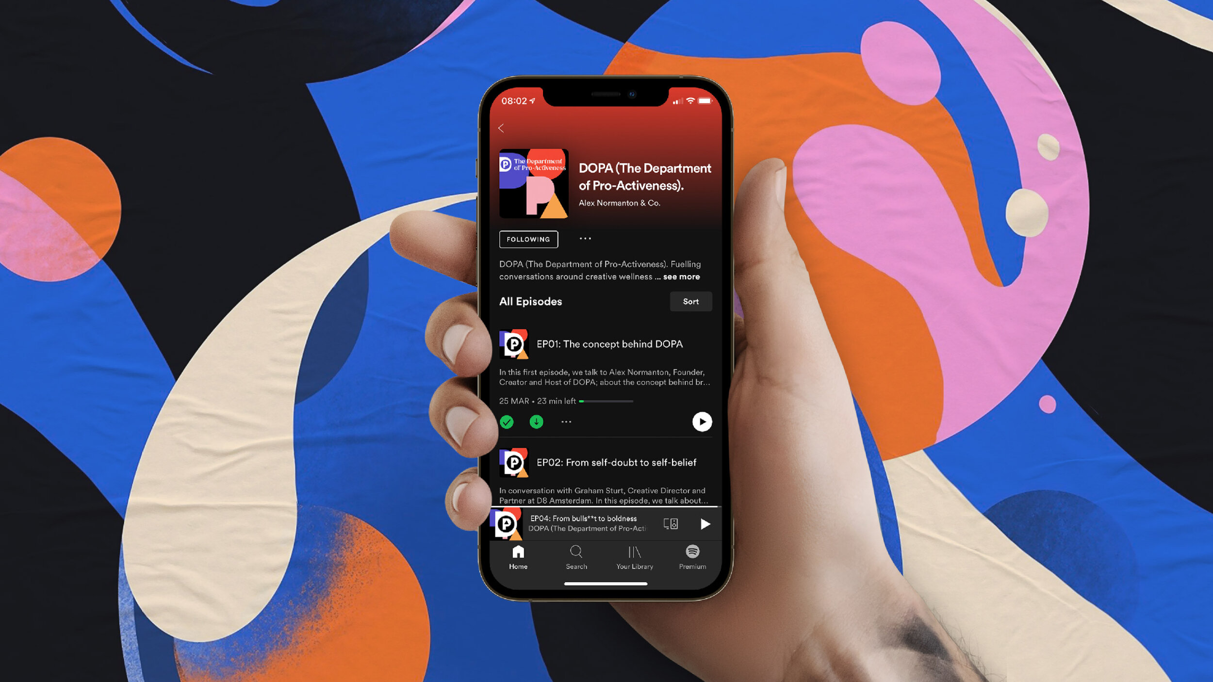
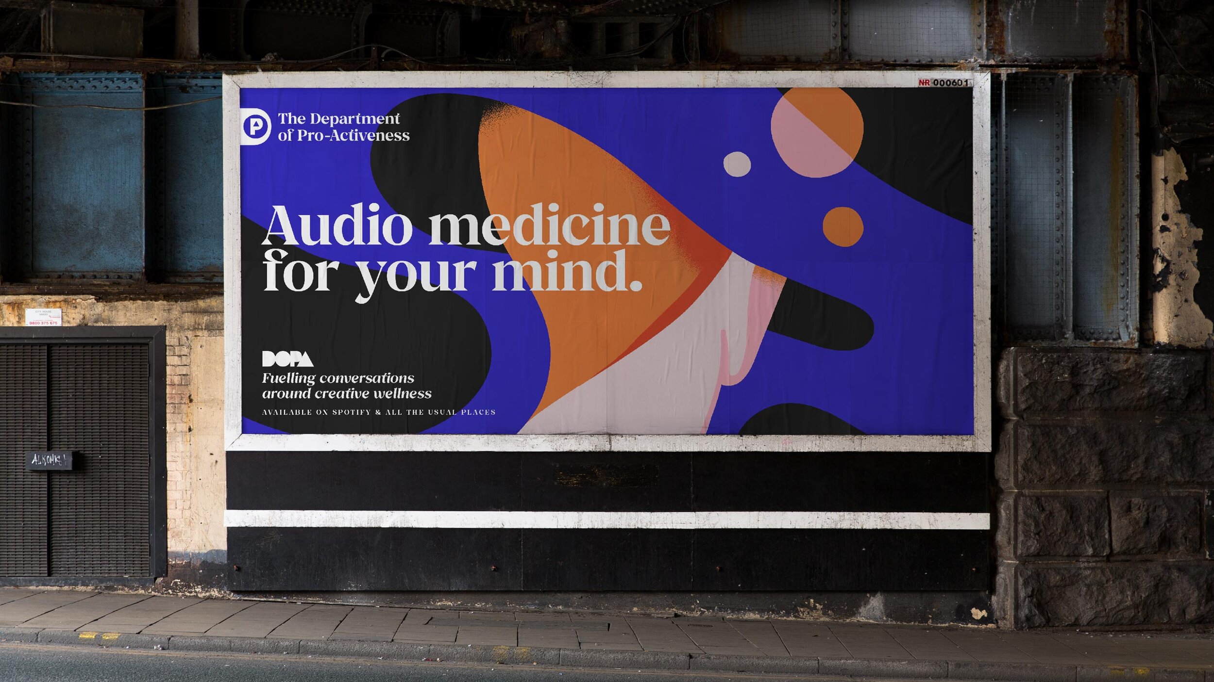
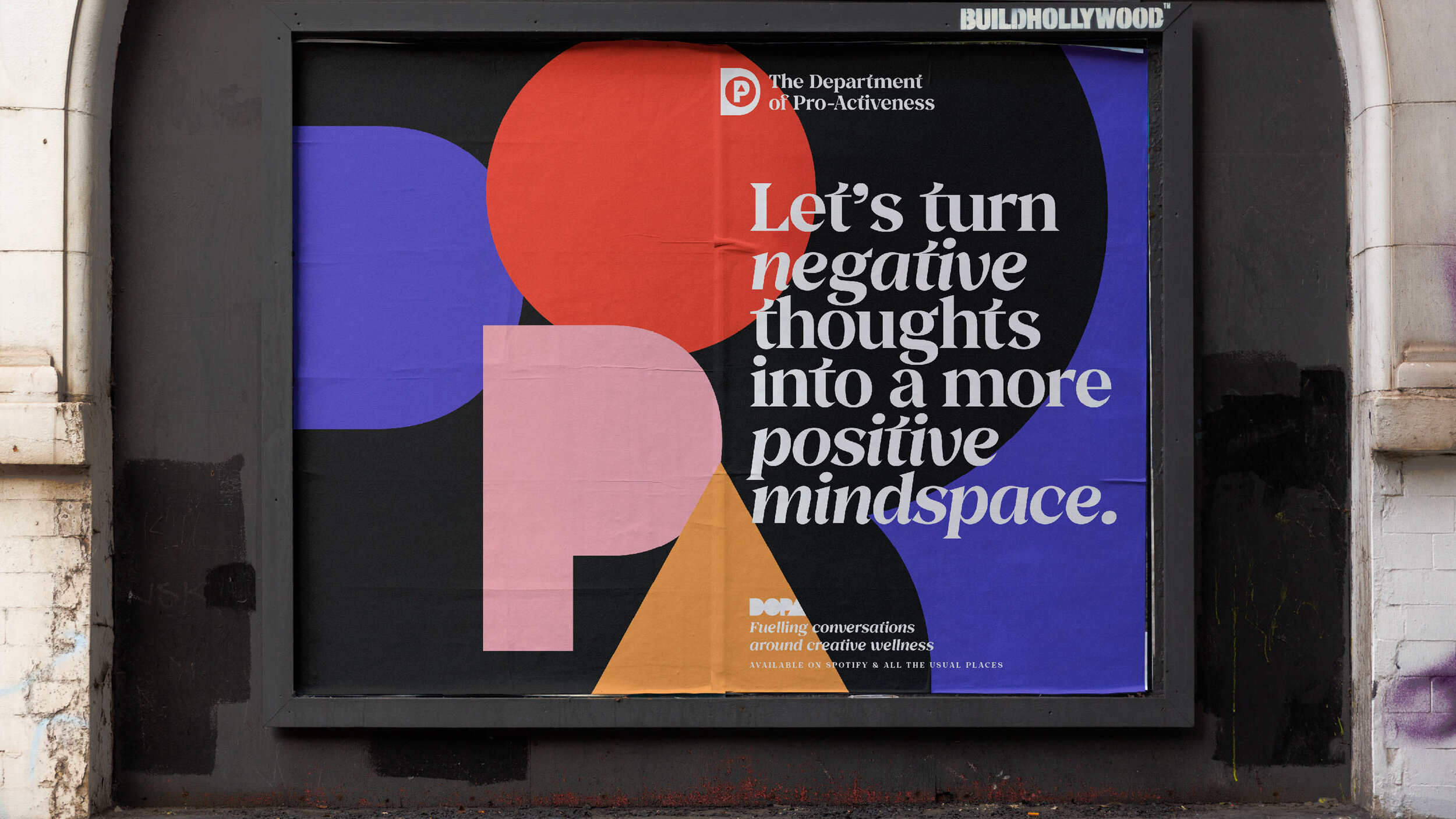
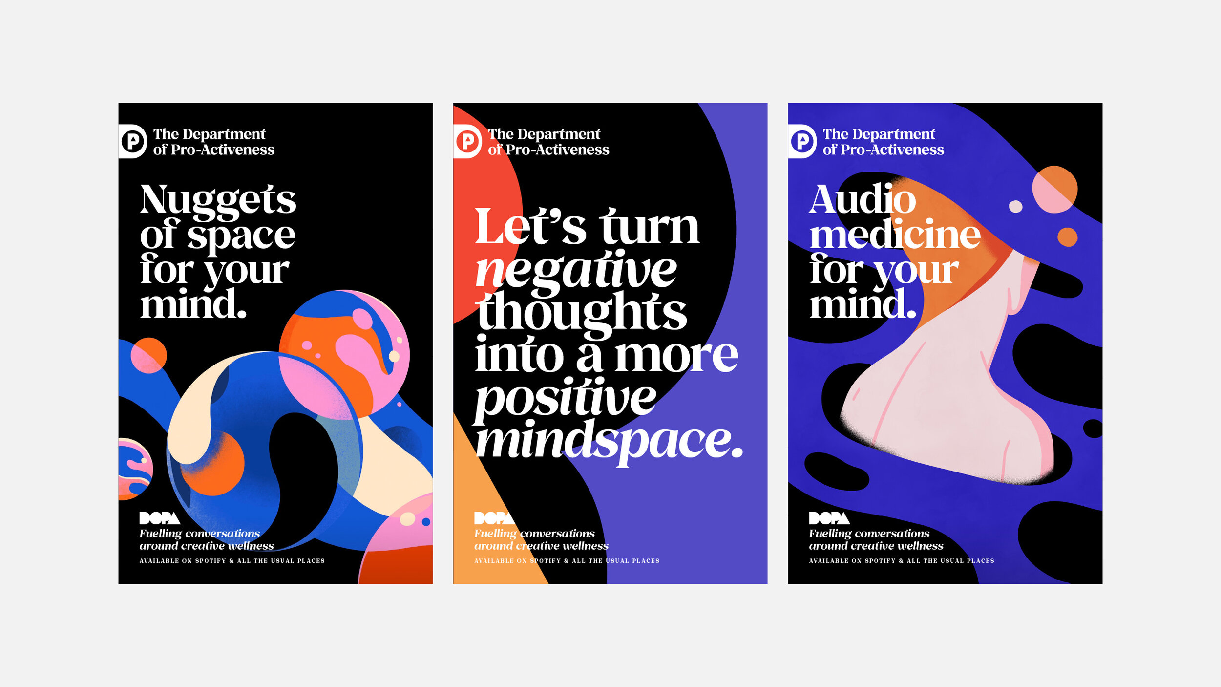
DOPA (The Department of Pro-Activeness) is a brand and podcast that aims to fuel conversations around creative wellness and put positivity back into the hearts, minds and ears of people working within the creative industry.
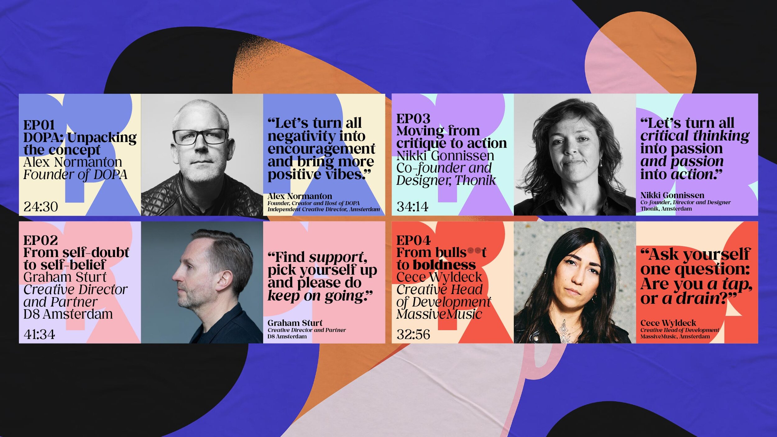
A department to pro-actively seek out candid conversations around specific topics ie: fear, self-doubt, failure etc and to ultimately facilitate change.
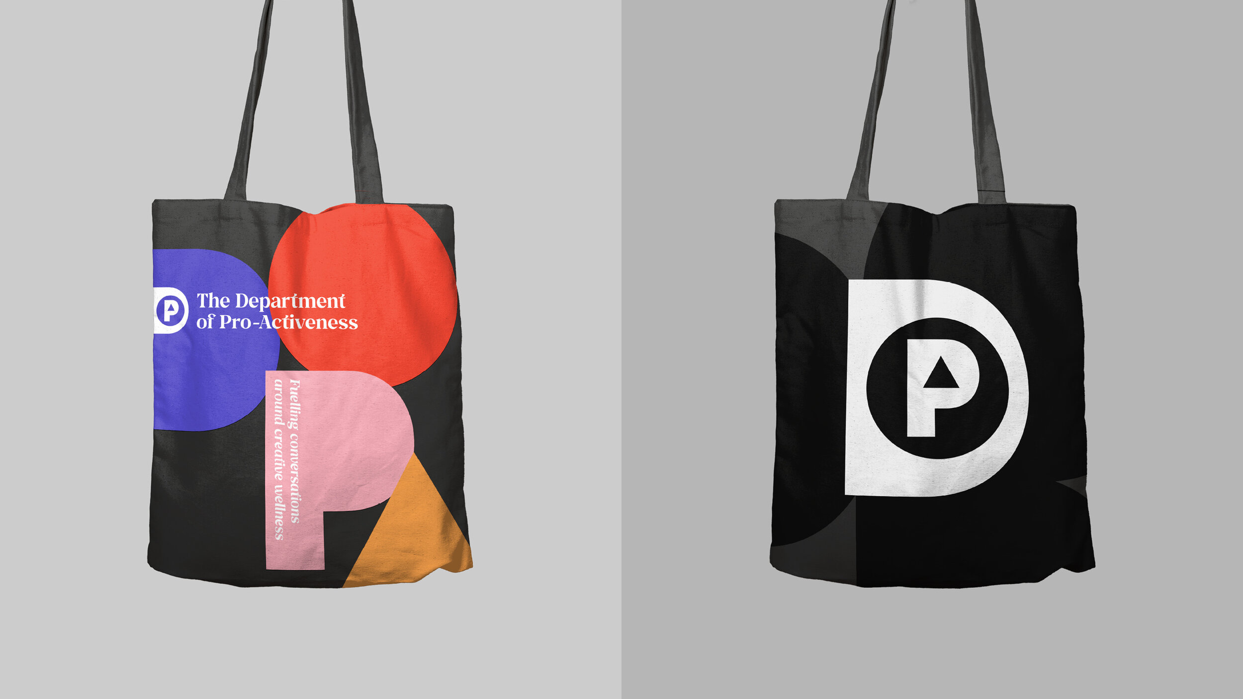
The brand was created to resemble an official governing body, whilst feeling uplifting, positive and empowering. The ‘D’ monogram contains simple geometric shapes that represent the letters of the DOPA acronym. As humans, we are in a state of flux; constantly evolving, changing, developing and growing alongside the ideas we create. The motion solution allowed the geometric letterforms to morph, flex and shape-shift with versatility and ease.
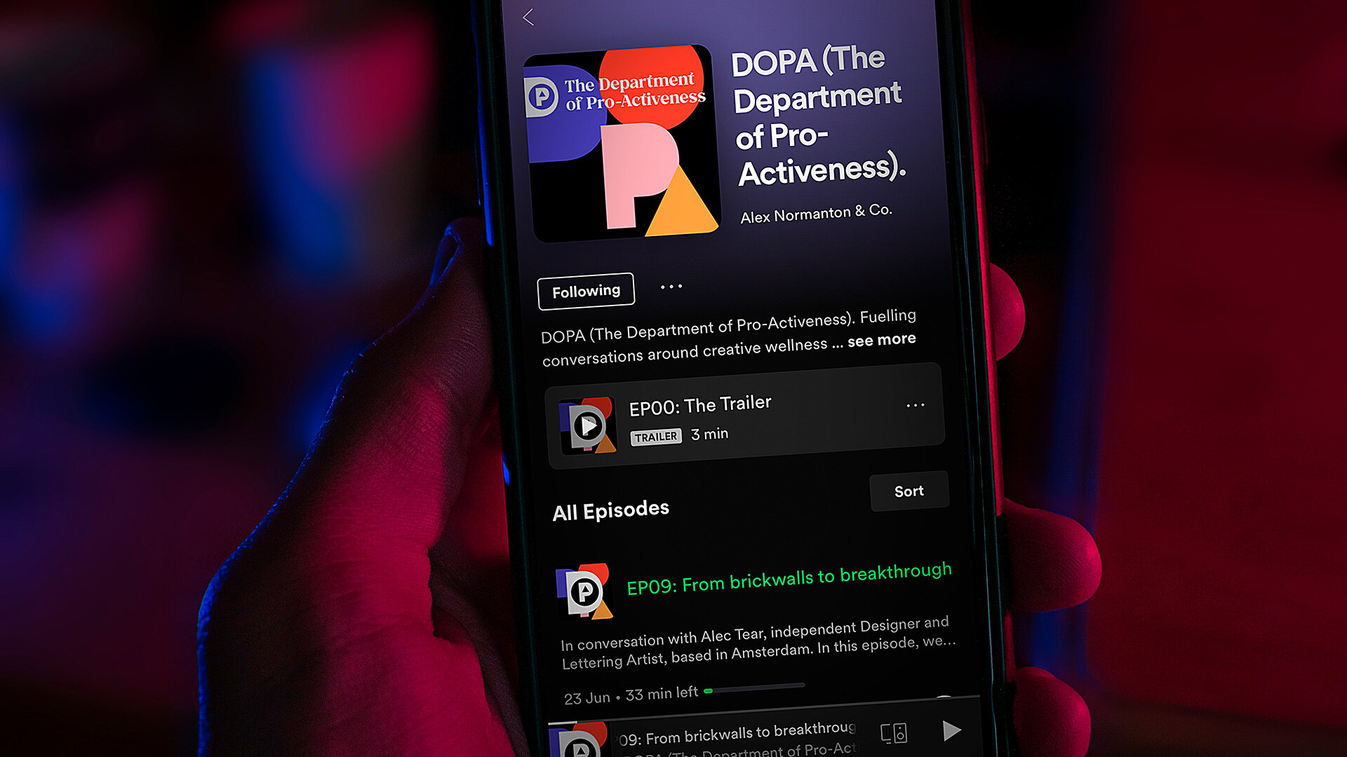
Listen to the podcast
Awards
Graphis – Silver (Branding)
World Brand Design Society – Silver (Branding)
ADCN – Finalist
Creative Direction, Copywriting & Design: Alex Normanton
Motion Theory, Language and Design: Jeroen Krielaars
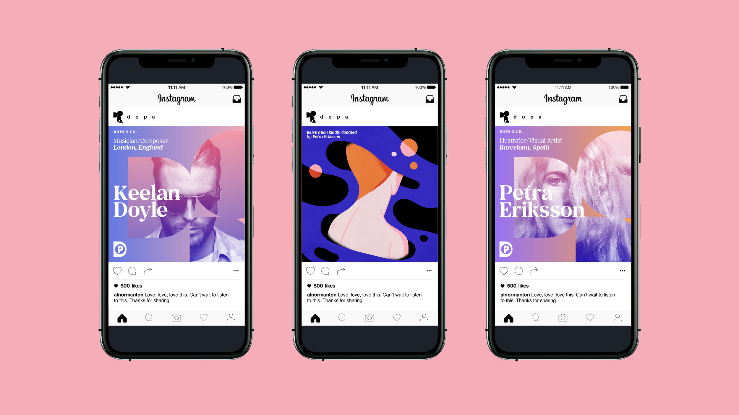
Illustration: Petra Eriksson
Music: Keelan Doyle
Typeface Design: Gradient Type